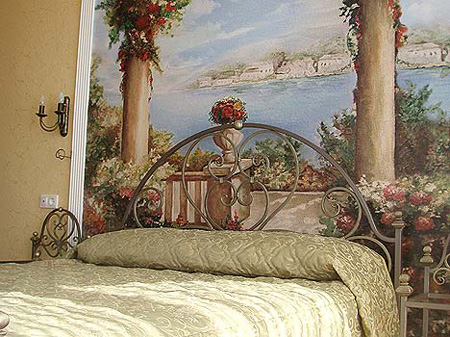
Interior Hallway To Small Apartments

Least amount of time we spend in the hall, but on what will be the last five minutes before leaving or returning home may depend on the mood of the day. It will take time, whether it is in blissful placing objects in the mirror or in the confusion of finding the keys on the concrete floor - it depends on you. And how you will be able to organize a small but important space.


Often we think that this space should be freed as much as possible, leaving a minimum of furniture and throw most things.
But it is necessary to take into account all the details. You should think of coming home, and where we put an umbrella or keys, bag, gloves, or hat - all this at a minimum. And it would not hurt to put somewhere phone. If the hallway chaos of randomly scattered things, then, perhaps, just be under a pile of trash pograblenny.


An indicative list of useful things for the interior of the hall:


- At least a small console, but it is always needed in the hallway;


- An indispensable attribute - wardrobe or hanger, and with hooks for bags or belongings;


- A small housekeeper, attached to the wall.
An interesting addition to your decor can be fashionable or zontnitsa gazetnitsa;

- Stand for shoes;


- You can put an ottoman in the hallway or small sofa, make it easier to put on one's shoes;


- Must be in the hallway mirror, preferably full-length.


To cover the floor in the hallway should be taken very seriously, as this room the first to take a trace of dirty shoes on their rigid soles designed for the street.
We should not lay in the hallway flooring, as it demands a careful care, and in the hallway always maintain perfect purity is not so simple. In addition, this floor quickly absorbs fluid and, therefore, quickly lose their original character.

The most practical option would be tile.
It is scratch resistant, easy to clean. But not everyone likes tile because it is slippery and cold.


You can choose to laminate floor hallway, but there is one drawback, it refers to a noisy covers.
Well it will look a cork floor with a special coating, a floor you will last a long time and accurately.


To make more space in our hallways and no large corridors, many successfully combine residential and entrance area, killing two birds with one stone this: living-room seem more spacious, and in the hallway there is a sense of "Trapped" walls.
But do not forget to highlight these areas, such as different flooring, you visually differentiate between these two zones. Between the apertures can be a hallway and living room make the arch, it will be one of the brightest parts of your interior.


Original course - establish special-through shelves of spacers between floor and ceiling.
Such structures can serve as a hallway or living room, you choose.

If you have a small hallway, and you want to visually enlarge, not connecting it to another room, then take a look at the wall.
It is not necessary to sheathe the walls of a hall tree or painted a dark color, and avoid the small picture on the wallpaper. The best solution for you will be bright colors and large picture wallpaper. I suggest you hang a mirror - this is one of the bag of tricks to enhance small spaces.

As for the style - you choose, there are no restrictions.
Style must fit into the hallway style apartment.


Original source uhouse.ru

Japanese Style In Interior Design


For a modern European style of Japanese attractive, interesting and unusual. Exoticism and sophistication of the east has always attracted and fascinated.

There is a desire to explore and even create their home in the Japanese style of interior design. But, nevertheless, be made ​​before the creation of the interior in Japanese style would be wise to thoroughly explore this puzzling to a European style.


The interior in Japanese style is simple and elegant. Japanese style room in the design is, without exaggeration, life style, which is characteristic of minimalism. The interior contains only the most necessary things, but at the same time, the room is not empty. The room has all the necessary items to create comfort, with partial or complete elimination of the decor.


Disposition of Japanese house or apartment "free" with a maximum of open space. This means that in an apartment or house, as a rule, there are no capital barriers. The role of light wooden partitions perform the screen, traditional Japanese sliding wall or textile curtains. Light frame sliding doors made ​​of wood and inserted it into squares of frosted glass or rice paper. Thus, a room in an apartment or house can easily increase or decrease depending on the willingness of the owners or the circumstances. If the apartment is the balcony, the wall adjacent to it makes sliding. And in the loggia arranged a small Japanese garden, as the garden is a continuation of the traditional interior.


Flooring in the room of light wood planks varnished or poryto ottsiklevano. Beds on the floor carpets and mats.


The walls are plain and painted in bright colors. Window openings from floor to ceiling. Typically, graphic design window frames and sliding doors is the same. The windows are rarely draped textiles. If there is a textile on the windows, it is very simple. Basically, windows, or left without curtains or blinds closed. On the walls of framed paintings of landscapes, panoramas of nature or the gardens of Japan.


In Japanese interior furniture in the minimum possible height. Plane of the table, couches and beds are as close as possible to the floor. The very furniture made ​​of natural materials, light-or dark-colored, smooth, nefakturnaya. In Japanese bed mattress is less than the podium. Very common closets, custom made ​​for living rooms and hallways. It is in their Japanese store their belongings.


Hieroglyphics is another feature of the Japanese style. They are decorated with furniture, cabinets, wall panels, and textiles.

Textiles - silk or organic cotton white or cream color.

An important feature of the Japanese style is a natural bright colors of the interior. This white, creamy, milky, beige.


Lighting in the Japanese interior plays an important role. Through large windows the room is illuminated by natural light very well. Artificial lighting in the interior is soft and diffused. This coverage is obtained by applying the lampshades made ​​from paper, silk or matte finish.

The lush bouquets of flowers for the Japanese interior irrelevant. It is quite enough of a beautiful flower in a vase. As for house plants, here is kept simple and concise. This may be one tree bonsai.


When you create a European-style Japanese interior design in your apartment you should not blindly copy the techniques of Japanese interior. First of all, the correct thing to remember is that housing should be convenient to stay. Agree that to sitting on floor cushions, chairs instead of the usual need to learn.

original source uhouse.ru

The Interior In Antique Style

Antique style certainly have admired. How can we remain indifferent to the architectural monuments and sculptures of ancient Greece and Rome? It's a well-known Colosseum or at least the temple of Demeter, a sculpture of Hercules resting. Next list all that we have inherited from antiquity, has no meaning, only take up much space. And the interior of the antique unconditionally also worthy of admiration. By the way ancient (Greek) style appeared on the lands of the Aegean Sea, and is considered the progenitor of Classicism, Neoclassicism, Renaissance. Romans is the disciples of the Greeks.


That the Greeks had the idea to sneak into the room bearing street columns and thinking that it would be nice. We still agree with their new solution in the interior. But the antique style is primarily geometric shapes, moldings, no-frills decor, sleek lines and bright colors.


Want to impress family and friends unusual interior apartment? Choose antiquity. Nowadays, this style is popular - is gaining momentum in fashion. Not bad for my room arrange the space where once lived a wealthy ancient Greek or Roman, and plunge into an era when there was no TV, no radio, no internet. Many things did not exist, that we have now. Still was an advanced civilization, the fruits of culture which we, in our technological age, we admire and borrow.


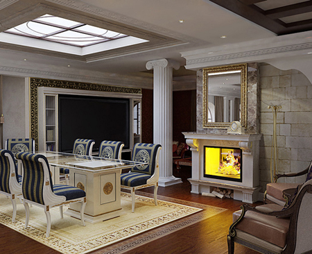
To create the antique style in the room to simulate a portion of the house: to establish smooth columns with capitals in the shape of a lotus with them resting on the beams of rectangular shape. They usually white. Or venture to build the rotunda of marble. And for the greater effect of antiquity to be done on the pillars cracks and breaks. Complement the interior does not interfere with small chests.


Way to judge the antique furniture, we can only drawings and reliefs extant vases. These are small boxes, benches, cabinets, tables, on three legs, which had the shape of paws of animals. So that the furniture we can certainly dream. Who knows what was in fact the furniture of the ancient Greeks!


The floor must be tiled with natural stone or covered with a mosaic, the walls are plasterboard oblitsevat better then to be comfortable in them to make a niche for antique vases and figurines. The walls are done in bright colors, painted ethnic ornament of ancient times, in addition to decorate the large mirrors and lamps made ​​of bronze. Suspended ceiling made ​​of plasterboard with a raised ledge, put on a floral pattern or a complex relief.

The interior in antique style
Create an atmosphere of antiquity will also fire or imitation, and of course, modeling.


The interior in antique style

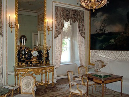
The windows also must be registered properly with the curtains with the presence of beautiful Greek folds. Fabric for curtains should be easy to choose light colors. Canvas curtains to throw a cornice or pelmet. No need to just lose that blinds in antique style requires more severe wrist and grabs. These shades underlined the tenderness of the ancient style.


The interior in antique style
Thus, our task is completed, we now live in an apartment of antique twenty-first pitch. The ancient Greeks would have envied us, as we are so contrived!


The interior in antique style

The interior in antique style

The interior in antique style


original source uhouse.ru

10 Fresh Ideas For Space-Saving Bunk Beds

Stylish bunk beds are rare in the modern world full of astonishing abundance of all kinds of furniture. That is why I offer you a compact 10 fresh ideas bunk beds, which may help you to solve housing problems.

Cosmic scale up the problem in large families living in urban mnogostroykah, on this occasion there is a lot of offers space-saving furniture, but the efficacy of such products is not enough. Children need their own space, which would enable them to develop normally, and parents, in turn, do not want children to interfere with their plans.

It is at such moments it is time to think about the new approach to the design of your room, think about the advantages of choosing furniture bunk, because it is perfectly save space, and uses the allocated space to the maximum.

The colorful design or strict bed for everyone to help build a pleasant atmosphere of harmony and tranquility in your home, install an invisible contact with its inhabitants.

It is hard to imagine a more convenient solution for bedrooms of children than a bunk bed! Active and restless children will appreciate it, and bunk beds - is not only comfortable beds, and this additional space for fun and games.

The first member of the hit parade ideas of bunk beds room number 1 run in the style of baseball field, from designers keen on the sport, the key feature of which is solid, leather armchair in the form of gloves, and thick feather pillow in the form of a baseball.


Candidate number 2, the room is called "The Ninth Wave", a bed suspended on ropes, similar beds on the ship, gray tones create a feeling of the cabin on the ship, and the atmosphere sozdaetsya voyage.


Room number 3 "Blue Lagoon" an amazing combination of soft and case furniture. Modular construction is designed to store children's clothes, books and other things. In addition, built-in desk, which significantly enhances the overall functionality of the design.


Room № 4 budget option for a very small residential area. Has built-in backlight, and a shelf for books, bright light provides good illumination throughout the room. Beds are made ​​of lightweight aluminum alloy, having great strength, so that they will be able to sleep is not only a child, complete ladder of the same alloy.


Room number 5 for small areas, has a bunk bed with original design, sturdy and functional wooden structure vpisheshsya in any interior, the lower bed is raised above the ground, that will keep children's things out there.


Room number 6 is executed in classical style, with a bed, as if torn from an old American movie, in every step of the built-in drawers for things, and at the bottom of the bed is built rack for bed linen.


Room number 7 "Pirate schooner" like a room number 2, though the bed is not suspended in the air, and is a block, a wooden structure. There are four beds each with book shelves, two lower drawers for linen. Fishing net on the upper levels, the brainchild of designers who will catch restless babies sleep.


Room number 8 is compact, light bed, saves a lot of space child's room, she does not have any compartments, except for bed linen, but quite functional and easy to fit in your interiors. To comply with the order in a room provided for wood construction with storage compartments and shelves for books.


Room number 9 is made ​​in the style of "minimal", not all possible obremeno decor is light, simple in nature and it is very functional.

The solid construction includes a wardrobe, a bed, a shelf for books, drawers for linen, drawers for clothes and a small bedside table, which frees you from buying more furniture.


Room number 10 has a huge two-tiered structure for the owners of a large area in the bed built wardrobe, shelves for books, clothes shelf and drawer for toys. Very functional and fabulous room design will establish a carefree atmosphere of your home.


original source uhouse.ru

How To Equip A Large Apartment

The problem of "how to comfortably accommodate a studio apartment in a family of four" is close to many people. On the Internet there are many solutions to this problem, and even ready-made projects.

However, people with a large enough housing, faced with a dilemma no less difficult (possibly even more complex) - how to arrange and complete than its tens of square meters.

It would seem - has never been easier. Furniture, household equipment standard equipment, kitchen, nursery, living room, bedroom, balcony, bath and toilet. All the rooms in different colors (or equal), window plastic, glass-enclosed balcony, the door is metal. This is how most of our apartments. However, in most cases, this logic arrangement of dwellings makes him look like a furniture store, hardware store and flea market all rolled into one. Or the other extreme - the apartment naked and empty, and in the corners of the echo from any noise. Sounds familiar, huh?

Objective - to turn it into a modern, ergonomic, beautiful and comfortable accommodation.

We start with the finish.

The type and style of decoration should be the same throughout the apartment. No color or finish materials, namely, the type and style. This will give a sense of wholeness, harmony and consistency of your home. Try to avoid bad or not combined combined colors. Remember the effect of color on the perception of space.


Interior items should organically fit into the surroundings. Ate the overall style of modern interior design, the plastic under the stucco and objects in the classical style are clearly out of place.


Furniture ... Furniture in a large apartment - a special theme. It should not clutter the space and create a feeling of emptiness. Furnishings, it is desirable to do according to the proportions of housing. Minimum of furniture, clearly inscribed in the interior and at the same time having the maximum possible functionality, is the ideal worth striving for. One solution - built-in closets to get rid of cabinets, canisters and other storage facilities. To those who say that the built-in furniture they do not have enough to hold all the things that you can answer that gathering - it's a problem of psychology rather than design.


The remaining interior items - appliances, drywall and other construction - should also help to maximize the functionality, convenience, comfort, beauty, harmony and comfort of your home.

Lighting is also an important part of the design of spacious housing. Errors in reporting apartments can negate all your previous efforts.

Chandeliers in the apartments look ridiculous. The light source must illuminate all around, and not himself, and at the same time create a cozy atmosphere. Highlighting the walls and ceiling in combination with wall lights - the perfect solution for this. If you want brighter - turn on the spotlights, which are all around flooded with bright light.


Do not forget the curtains or blinds on the windows. They help to evenly distribute the light coming from the windows throughout the house and create a warm and welcoming atmosphere.


Remember that your home is a mirror of your personality. Do not be afraid to experiment, and you will surely achieve his.


original source uhouse.ru

7 error in creating the interior


Unfortunately, or perhaps fortunately not all of us, starting repairs, we can seek the assistance of qualified designers. And so it goes in our personal views about how to make a home beautiful, comfortable and functional. But even the most successful ideas sometimes fail. How to avoid mistakes and make a reality of all of your ideas?


Mistake 1. Wrong start.

Usually the first step is to young designers to select the color of the walls, but the professionals are advised before choosing wallpaper, tile or paint, first decide on the furniture and textiles, otherwise all your subsequent creative impulses will die as a result of not complying with the colors of the walls. In addition to paint and wall pokleit always more economical than buying new furniture.


The style and color scheme of interior parts sets the tone colors of the walls, and not vice versa. Nor should we choose some central thing, such as a cupboard or sofa, and then navigate to it when you make the whole interior. This thing just starts to annoy you, as the whole interior. It is better to avoid too overt emphasis on furniture and pay more attention to detail.


Mistake 2. Placement of furniture "on the machine."


Before you decide to buy furniture with its size and location in the room. Always consider the possibility of visiting the house of some additional furniture such as chairs, cabinets, shelves, and technology. The room should be spacious and not cluttered, otherwise you will quickly get tired of it.


Illiterate planning - is primarily a standard approach. Try not to put furniture as standard, strictly along the walls. Include fantasy, forget about where was your sofa, TV, wardrobe before. Change the space and you will see how transform your interior. The arrangement of furniture - is the key to effective zoning.


Mistake 3. The ceiling of ice.


Ceiling color - always white. This stereotype has taken root very long time, ever since Soviet times. In fact, if you have a small apartment with low ceilings, the white visually enlarge the space, but if your interior is built on a bright contrasting colors, it will look better ceiling pink, blue or yellow flowers. Many designers are now using even black color, it should be done correctly, but the effect is truly impressive.


Selection of colors - is the main task, which is the right solution to success. Big name designers often resort to unconventional solutions, using the incongruous at first glance, the color, but it is such a method allows us to make a room unique, unlike any other.

Mistake 4. The pursuit of an ideal fashion.


Photos of other people's interior on the Internet always evoke the desire to do the same in their beauty. But do not forget that space makes its own rules and ignore them is impossible. Fashion trends do not always fit into our apartment, because they rely on a lot of space and unlimited financial possibilities. So lie down let the picture from the Internet, and a couple of weeks back to them and to cock the pros and cons.


Not the best assistant to happen and perfectionism - a desire that every thing is perfect fit. Today, fashion is eclectic - a mixture of different styles and trends.


Error 5. The massive chandelier in the dining room.


Chandelier, exceeding the size of the table itself, will look out of place, and distract the attention of all.


Mistake 6. The house-museum.


The desire to show everything at once can sometimes play a cruel joke with us. For example, a large number of small souvenirs from different countries can be unpleasant to stand out in front of the designers call it "visual noise". The same applies to a variety of collections that people typically have in your living room. All this creates a feeling of clutter and old your home decor.


Error 7. Bare windows.


Impeccable view outside the window frame and expensive is not a reason to "strip" windows. Without any interior textiles in the windows will look dull and uncomfortable. Now there are countless different curtain tyuley, curtains, which scatter light and create the correct color the mood of the room. In addition, the curtain has always been a symbol of protection, since it covers your life away from prying eyes.


original source uhouse.ru
Related Posts Plugin for WordPress, Blogger...

Labels

(1) (2) (1) (1) (1) (1) (2) (5) (4) (1) (2) (2) (15) (1) (2) (4) (1) (6) (12) (1) (7) (5) (3) (2) (3) (3) (1) (5) (1)

Special Categories

deDecor.blogspot.com